My magazine represents rappers and individuals who are interested in rap music. The reason for this is due the contents of my production. The front cover represents rappers as thugs. This is done by the main image consisting of a rapper with a not very welcoming, serious facial expressions, along with him holding both his hands up, showing a come at me or bring it on pose, which links to someone who is rather rude and doesn't care very much about what might happen as he isn't afraid of anyone. Another thing that contributes to representing rappers as thugs is on the contents page, it is the article relating to drugs and alcohol. This helps represent them as thugs as drugs are illegal and aren't advised to be taken, again indicating that rappers, don't care and don't follow the rules.
My magazine also represents rap artists as successful too, although they are shown to be thugs, which are two things that may not really be associated. The reason for this representation is because of on the front cover, contents and DPS, rap artists are shown to be successful through text. Firstly, the front cover has sell lines advertising articles, about a breakout album, and top 10 singles albums which are also mentioned on the contents page. Secondly, the contents page mentions what i just said along with most wanted tours. Finally the DPS' headline mentions a guide to success along with the article contents being about being successful. Each piece of my production represents rappers as successful because each section states a positive, successful thing about rap artists. For example, most wanted tours represent success because if the target audience wants a certain rapper's tour, they most be successful to be that popular. Also, top 10's represent success because if a rapper is within the top 10, or better that at number 1, they must be successful, again to be that poplar and have so many people like their music. Lastly, a guide to success represents a rappers success, because they are giving tips on how to be a success, which must mean they know what they're saying.
Monday, 21 March 2016

Sunday, 20 March 2016
Draft No.1

After conducting some research on my target audience. Some changes will be made the above draft. The target audience feels that the date in the bottom left is out of place as it is down to the left out the way. So I think I will change it to the top somewhere around the title to make it clearer to see when looking at the masthead. Another thing that has been suggested is the clarity of the sell lines. It seems that the sell lines are blending in with the background image, making it harder for the target audience to notice and read. I'll change the clarity of the font by either adding a text book behind with reduce opacity, to allow it to look clearer against the image or by making the text bolder so it stands out against the main image.


Research has also told me my DPS could include some changes. The first is the positioning of the headline. They feel it is too central, therefore cross the gutter of the magazine. So to make it appeal to the target audience more, I will move the headline more to the left hand side of the page so it doesn't cross that gutter as much and allow the majority of the right page be focussed on the main image of the actor. Another thing the target audience feel can be improved is the font. This is because the article font is all capitals, which looks odd in a magazine as common conventions of a magazine will have the article font be in regular writing with upper and lower case text. So by changing this to a more regular font I may be able to better attract my target audience as it will suit their particular needs and interests.
Monday, 14 March 2016
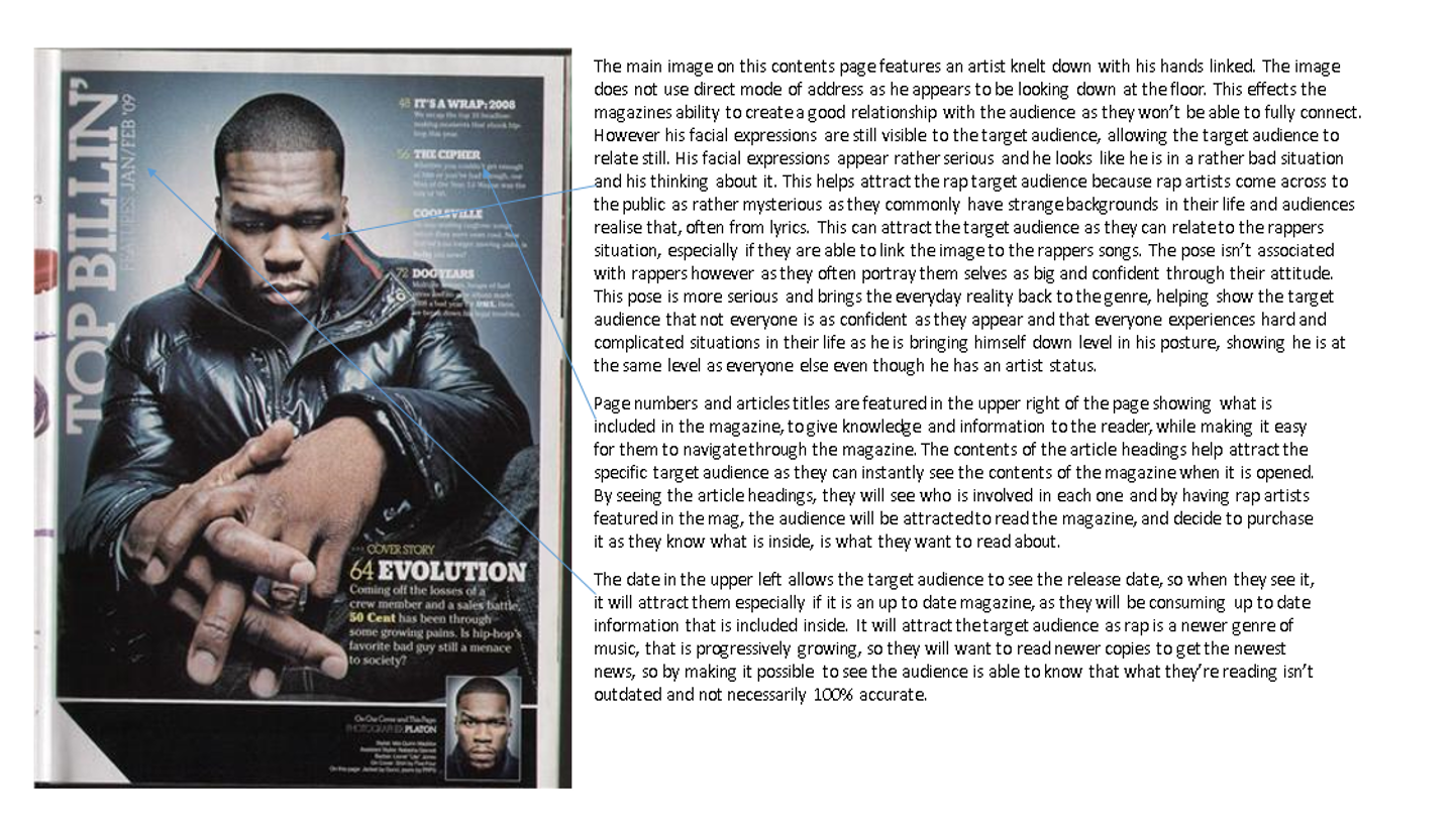
Contents Analysis
These 3 pictures below are all analysed contents pages from 3 different magazines. The analyses mainly contain how target audience is attracted successfully and why this happens as it is very important that magazines continue to attract target audience throughout the magazine and not just on the front cover. This is because it is the first real informative part that gives the audience an insight on what's inside and is a big persuader in making them buy this certain product. Along with that there are parts where common conventions of a magazine is used as it is essential that magazines, use in the magazine what should be used. This is to make sure the magazine looks professional and believable and doesn't look fake. This again also plays a big role in attracting target audience.


Thursday, 10 March 2016
DPS Changes

This above was my initial draft of my double page spread. The font I used was called Trajan Pro and it is a rather classic and basic font which is a reason why I used it as it may typically break the rap genre stereotype as it doesn't really fit well because rappers are seen as thugs rather than classy. Another reason I used it is because it was very simple and looked clean on all of my production pieces and didn't look out of place when combined with photos and other conventions of a magazine.
 But after speaking to multiple members of potential target audience, I have altered the production. I was advised of what I already knew but what I decided to go against. I was told that the font didn't fit in with the genre of the magazine. This meant the the magazines professionalism will be lacking as the magazine wouldn't look real or believable. Therefore meaning it wouldn't attract the target audience very well because at a glance, the target audience may not realise it is a rap magazine as they are unable to create a relationship with the contents of the magazine and therefore not buy it and may buy a more professional magazine. Another reason I decided to take the advice on board and change the font is because this new font does relate to the audience more and also suit the genre much better. This is because rap is a modern type of music, so using a modern font, benefits the magazine as the two link together well, to help attract the gaze of the target audience and also makes the magazine look more realistic and professional. The font is also bold, as is rap music due to the lyrics they commonly contain. So this factor, as with the previous one, helps better attract the target audience of rap as they will be able to relate better to the font as it is more associated with rap music and can contribute to the magazine creating a relationship with the reader as they will easily be able to tell the magazine is a modern magazine which it is.
Wednesday, 24 February 2016
Shot List Photoshoot

The reason I decided not to use this photo within my magazine is because the photo wasn't in focus, therefore causing it to be an unclear and blurry picture. If it was used it would cause the magazine to look poor and unprofessional. The target audience may not be able to relate to the actor in photo as they may not be able to see them properly and gain a true relationship from their identity, as you cant see their face properly. Due to it looking unprofessional, the TA may decide against buying this product as they may see it as an unreliable magazine and then decide to buy competitors products.

This is also a photo I decided not to use in my magazine due to multiple reasons. First off all is due to the back ground colour. For a rap magazine, this isn't a suitable colour to be associated with a rapper as it is to bright. A darker, more subtle colour would be a smarter colour to use, like the once used in the photo below. Having this particular colour as a background colour that largely stands out within a rap magazine, would affect the magazines reliability and professionalism. This is because it is too friendly and doesn't fit in with the rap stereotype. This means that the target audience may decide against buying this product and want to buy one that looks more like what they are looking for, that they are able to relate too and attracts their attention.

I did actually decide to use this as my picture for my double page spread within my magazine. The reason for this is because I used the rule of thirds and positioned the actor to the right of the landscape shot. This therefore leaves space to the left side of the picture which is ideal for placing my text, helping it look more look a professional magazine and helping persuade the target audience to purchase this product. Using a rule of third and having the image look like it does, helps it fit in with common magazine conventions. Another reason I used this picture is because of how the actor looks. He possesses a rather shady look as he is looking away from the camera and not giving direct mode of address to create a direct relationship with the audience as well as the shadow that is located to the left of him . He also isn't giving a away his full identity as not all of his face is visible. This is beneficial for a rap magazine as rap artists are stereotyped as being rather mysterious and quite scary, so this will help the target audience relate to this article and make the article look like it is in the right magazine and not out of place.
Subscribe to:
Posts (Atom)